
The core elements of web design are the foundational pieces that dictate how your site looks, feels, and actually performs. Think of them as the key ingredients: visual design, user experience (UX), technical performance, content, and search engine optimization (SEO). When they all work together, they create an online presence that doesn't just exist—it gets results.
Your Website Is Your Digital Storefront
Before a customer ever calls you or walks through your door, they visit your website. This is your digital storefront, your virtual handshake. Does it make a good first impression? Is it welcoming, easy to look around, and does it immediately show people why they should stick around?
So many businesses get stuck on the surface-level stuff, thinking web design is just about picking pretty colors and cool fonts. But that’s a huge mistake. The real elements of web design are the building blocks of customer trust, user engagement, and—ultimately—your bottom line.
Just like a messy, disorganized physical store would turn you away, a clunky or outdated website does the same thing online. In fact, research from DiviFlash shows that a staggering 38.5% of users will stop engaging with a website if the layout is unattractive. That first impression happens in a split second, and it sets the tone for everything that follows.
Building Your Online Foundation
A well-built website isn't just a brochure; it’s a strategic asset that guides a visitor on their journey from being a curious stranger to a loyal customer. Each piece has a specific job to do:
- Visuals and Layout create the immediate vibe and first impression.
- User Experience (UX) makes sure the journey is painless and intuitive.
- Performance and SEO ensure your digital storefront can be found and loads in a snap.
- Content delivers the answers and value your customers are actually searching for.
When these parts are in sync, you get more than a website. You get a high-performing tool that turns clicks into clients. At Raven SEO, our entire focus is on weaving these elements together to create something that not only looks professional but drives real, measurable growth. The principles we’re about to break down are the exact ones we use to build sites that work—feel free to check out a business website example to see these concepts in action.
In this guide, we’re going to pull back the curtain on each of these core components. You’ll learn how they shape user behavior, influence your search engine rankings, and build the foundation for a winning online strategy.
Crafting Your Visual Identity and Layout
You get one shot at a first impression, and on the web, that happens in the blink of an eye. The first thing a visitor judges is your site's visual design. This gut reaction colors their entire experience, making the visual elements of web design absolutely critical for earning immediate trust. It’s not about flashy graphics; it’s about strategically communicating who you are through color, fonts, and images.
Your color palette isn't just decoration—it's a shortcut to your customer's emotions. Blues often signal trust and stability (think banks and insurance companies), while greens bring to mind nature, health, and peace. A well-chosen color scheme instantly reinforces your brand’s personality and shapes how a user feels about your business from the second they land on your site.
This infographic breaks down how a website's visual elements work together, creating a foundation for real business success.
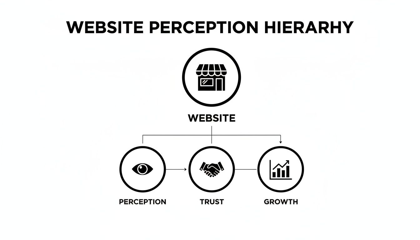
As you can see, a positive first impression is the bedrock. It's the first step toward building the user trust that ultimately fuels sustainable growth.
The Power of Typography and Imagery
If color sets the mood, typography is your brand's voice. A formal, serif font like Times New Roman can feel traditional and authoritative, making it a great fit for a law firm. On the other hand, a clean, sans-serif font like Helvetica feels modern and approachable—perfect for a tech startup.
The real keys here are consistency and readability. If your font choices are hard to read, people will just leave. Good typography makes the user experience smoother and subtly communicates your brand’s character without you having to say a thing.
High-quality imagery is just as vital. Generic stock photos scream "we didn't try," creating a sense of disconnect. Authentic photos of your actual team, your products, or your location forge a genuine connection. People want to see the real business they're about to work with; it builds instant credibility and makes your brand feel trustworthy and relatable.
A great visual design doesn't just decorate the page—it organizes information and directs attention. It creates a seamless flow that makes it easy for visitors to find exactly what they're looking for, turning confusion into clarity and clicks into conversions.
Creating a Clear Visual Hierarchy
All of these pieces—color, typography, and imagery—come together to create a visual hierarchy. This is simply the art of arranging things on a page to show their order of importance. Think of a newspaper: the main headline is huge, subheadings are smaller, and the article text is smallest of all. Your brain instantly knows what to read first.
Mastering the principles of visual hierarchy in web design is crucial for guiding a user's attention and creating a clear path for them to follow. Your website should use size, color, and placement to guide the eye, ensuring the most important message or call-to-action is the most prominent thing on the screen.
Here’s a quick breakdown of how visual hierarchy works in practice:
- Size and Scale: Bigger elements grab more attention. Your main headline should always be larger than your body text. Simple, but effective.
- Color and Contrast: A brightly colored button on a neutral background will pop off the page, drawing the user's eye and practically begging to be clicked.
- Whitespace: The empty space around your content is just as important as the content itself. It prevents clutter and helps users focus on what really matters.
Without a clear visual hierarchy, your website becomes a jumbled mess. Visitors won't know where to look or what to do next, which leads directly to confusion and sky-high bounce rates. For a deeper dive, learn more about our website design best practices in our comprehensive guide. At Raven SEO, we design with purpose, ensuring your visual identity not only looks fantastic but also strategically guides users toward your business goals.
Designing an Intuitive User Experience
A website that looks fantastic is only half the battle. If visitors can't easily find what they're looking for, that beautiful design is all for nothing. This is where we shift from how a site looks to how it feels to use—a crucial element known as User Experience (UX).
Think of your website's navigation as the signage in a massive department store. If the signs are confusing, missing, or just plain wrong, shoppers get frustrated and leave. A great website, on the other hand, provides clear, logical pathways that guide visitors effortlessly from point A to point B, making the whole experience feel intuitive.

This seamless journey isn’t just a nice feature to have; it’s the very backbone of visitor engagement. When people can navigate your site without having to think too hard about it, they're far more likely to stick around, explore what you have to offer, and ultimately convert.
The Science of Good UX
User experience is really a science focused on making technology simple and pleasant for humans to interact with. It's all about understanding how people think, what they expect from a website, and what drives them crazy. A positive UX means a visitor never has to stop and wonder, "Okay, where am I supposed to click next?"
This principle is directly tied to your bottom line. A landmark report from the Nielsen Norman Group found that investing in UX can yield returns as high as $100 for every $1 invested. Why such a massive return? Because a frustration-free experience leads to higher satisfaction, builds trust, and drives more conversions. A confusing website, however, actively pushes potential customers straight to your competitors.
If you're wondering whether your own site is a clear path or a confusing maze, you might want to read our guide on how simple navigation wins customers and boosts SEO.
Guiding Users with Clear Calls to Action
A key piece of an intuitive UX is the Call-to-Action (CTA). These are the buttons, links, and prompts that tell users what you want them to do next—things like "Buy Now," "Schedule a Consultation," or "Download Our Guide." A strong CTA is more than just a button; it’s a clear instruction that eliminates any guesswork.
Effective CTAs are:
- Action-Oriented: They start with a strong verb that tells the user exactly what will happen when they click.
- Visually Prominent: They use contrasting colors and smart placement to stand out from the rest of the page.
- Concise: The text is short, direct, and easy to understand in a split second.
Without clear CTAs, your visitors are left adrift. They might love your content, but if they don't know what the next logical step is, they simply won't take it.
A positive, frustration-free user experience is one of the most powerful signals you can send to Google. When visitors stay longer and interact more with your site, search engines interpret that as a sign of quality and relevance, which can directly improve your rankings.
Why UX Is a Ranking Factor
Google’s main goal is to give its users the best possible results for their searches. A website that is difficult to navigate provides a poor result, no matter how great its content might be. This is why metrics directly related to user experience are so important for SEO.
When users land on your site and immediately leave—a behavior known as "bouncing"—it signals to Google that your page wasn't a good fit for their search. Over time, high bounce rates can seriously drag down your search rankings.
So, how do all the pieces of UX fit together and impact your business? This table breaks down the core components.
Key Elements of User Experience (UX) Design
| UX Element | Description | Business Impact |
|---|---|---|
| Intuitive Navigation | A logical and easy-to-follow site structure that helps users find information quickly. | Reduces bounce rates and increases time on site, signaling content value to search engines. |
| Clear CTAs | Prominent, action-oriented buttons and links that guide users toward a conversion goal. | Directly increases leads, sales, and form submissions by making the next step obvious. |
| Readability | Clean typography, short paragraphs, and ample whitespace that make content easy to scan and digest. | Improves user engagement and ensures your key messages are absorbed, not ignored. |
| Consistency | A uniform design and layout across all pages, creating a predictable and reliable user journey. | Builds brand trust and makes the website feel professional and easier to use. |
Each element plays a crucial role in creating a cohesive experience that not only satisfies users but also achieves key business goals.
At Raven SEO, our design philosophy is built on this very principle. We craft websites where every element is designed not just to look good, but for functional clarity. This user-centric approach ensures that your digital storefront is a place where customers feel welcome, understood, and confident in taking that next step.
Building a Foundation for SEO and Performance
A gorgeous website with a slick user experience is a great start, but if it’s built on a shaky technical foundation, it’s like a mansion constructed on sand. The stuff happening behind the curtain—site speed, mobile responsiveness, and clean code—are the invisible engines that determine whether your site can be found, used, and trusted by both people and search engines.
Think of your site’s code as its blueprint and the server as its engine. If that blueprint is a mess or the engine sputters, everything else grinds to a halt. This technical integrity is where design truly meets performance, creating a solid foundation that supports every other marketing effort you make.
The Critical Role of Site Speed
In today's world, nobody waits. If your website takes more than a couple of seconds to pop up, visitors are gone. They'll just hit the "back" button and head straight to your competitor. This isn't just a tiny hiccup; it's a direct blow to your bottom line and your search rankings.
Page speed is a make-or-break element of web design. Research shows that websites taking over two seconds to load can lose up to 60% of visitors, while a tiny one-second delay can sink conversions by 7%. For online retailers, this adds up to billions in lost revenue every single year. You can dig into more of these eye-opening stats on web design at Hostinger.com. When a page loads slowly, it sends a loud and clear negative signal to Google, screaming that your site offers a poor user experience.
A fast website isn't a luxury anymore; it’s a basic requirement for survival. Google has officially made page speed a ranking factor, which means slower sites get actively penalized in search results, making them that much harder for customers to find.
To measure this, Google rolled out a specific set of performance metrics. If you really want to get into the weeds, you can check out our guide on Core Web Vitals to understand exactly what Google is grading you on. These are the technical benchmarks your site has to hit to be considered a top-tier result.
Why Mobile-First Design Is the Only Way Forward
The way people use the internet has completely flipped. Today, the vast majority of web traffic comes from mobile devices, not desktops. This massive shift means that designing a website for a big screen and then trying to cram it onto a phone is an outdated and clumsy approach.
The modern standard is mobile-first design. This strategy flips the old process on its head: you design the mobile version of your site first and then adapt it for larger screens like tablets and desktops. By starting with the smallest screen, you're forced to prioritize what’s absolutely essential, which results in a clean, uncluttered, and highly functional experience for most of your users.
A mobile-responsive design makes sure your website looks and works perfectly on any device. Here’s why it’s completely non-negotiable:
- Improved User Experience: It gets rid of all that annoying pinching and zooming, providing a smooth experience that keeps people on your site.
- Better SEO Performance: Google primarily uses the mobile version of a website for indexing and ranking (this is called mobile-first indexing). If your site is a mess on mobile, your search visibility is going to suffer. Period.
- Higher Conversion Rates: A slick mobile experience makes it dead simple for customers to buy something, fill out a form, or call you while they're on the go.
The Unseen Power of Clean Code
Last but not least, the code that powers your website is its structural skeleton. Your visitors will never see it, but search engines crawl and analyze it relentlessly. Clean, well-structured code is like a perfectly organized filing system—it makes it easy for search engine bots to figure out your site's content and hierarchy.
On the other hand, messy, bloated code can bog down your site, cause weird rendering errors, and make it tough for search engines to index your pages correctly. At Raven SEO, we build websites from the ground up with clean, optimized code. This ensures that every site we launch is not only beautiful and user-friendly but also built for peak performance and maximum search engine visibility right out of the gate.
Weaving Compelling Content with On-Page SEO
If your website's design is the storefront, then your content is everything inside. It’s the products, the helpful staff, and the expertise that convinces someone to stick around. It's the whole reason people show up. But even the best content in the world is useless if it’s a chaotic mess.
Think about walking into a library where all the books have been dumped into a giant pile. The answer you need is in there somewhere, but finding it is a nightmare. That’s what a website feels like without thoughtful structure. People get frustrated and leave.
This is where your content strategy and on-page search engine optimization (SEO) have to work together. It’s not about gaming the system by cramming keywords into every sentence. It’s about organizing your information logically so that both real people and search engines can easily understand what you’re talking about.
Making Content Scannable and Readable
Here’s the hard truth: people don't read websites word-for-word. They scan. Their eyes jump from headings to bullet points to bold text, looking for the specific nugget of information they came for. A giant wall of text is an instant dealbreaker.
Smart content design anticipates this behavior. It breaks down complex ideas into bite-sized, digestible pieces. This means using on-page SEO elements to build a clear visual hierarchy.
Headings (like H2s and H3s) act as signposts. Short paragraphs—just two or three sentences, max—give the reader's eyes a place to rest. And bullet points make lists or steps incredibly easy to grasp at a glance.
The real goal here is to make your content instantly scannable. A visitor should get the gist of your page in a few seconds, long before they decide to read it deeply. This user-friendly approach is exactly what search engines want to see, and they reward it accordingly.
Integrating Keywords Naturally
Once your content is easy to scan, you need to make sure it aligns with what your audience is actually searching for. This is where keywords come in, acting as a bridge between a person's question and your website's answer.
The secret is to write for people first. Think about user intent. Is someone looking for basic information, comparing their options, or ready to buy right now? Your content needs to meet them right where they are. When you focus on providing genuine value, the right keywords tend to fall into place naturally.
Here are a few practical ways to weave in keywords without sounding like a robot:
- Place them in your headings and subheadings. This tells both users and Google what a section is about right away.
- Include them within the first 100 words. This helps establish the page's relevance from the very beginning.
- Use a primary keyword and related terms. Instead of repeating the same exact phrase over and over, use synonyms and related concepts. This makes the writing feel more natural and shows search engines a deeper understanding of the topic.
When you get this right, your website becomes a magnet for the right kind of traffic—people actively looking for the exact solutions you offer.
Tying Content to Your Business Goals
Every single page on your website needs a job to do. A blog post might be designed to attract new people and build your authority. A service page, on the other hand, is built to generate qualified leads. The structure of your content is what helps it do its job effectively.
For example, a service page should immediately identify the problem it solves, clearly outline the benefits, and then guide the user toward a single, clear call-to-action, like "Get a Free Quote." A blog post might end by linking to another helpful article or offering a free downloadable guide, keeping the visitor engaged with your brand.
This strategic approach is what separates content that just exists from content that actually grows a business. To see how all these pieces come together, check out our in-depth guide on what on-page optimization is and how it drives real results. At Raven SEO, we help businesses create content that doesn't just rank—it connects with customers and becomes their most powerful sales tool.
Your Essential Web Design Checklist
Alright, we’ve covered a lot of ground. Putting all these principles into practice can feel like a massive undertaking, but breaking it down makes it manageable. This final checklist pulls everything we've talked about into a practical framework you can use right now.
Think of it as a quick audit for your current website or a guide rail for a new one. Each question is designed to help you spot weaknesses and find opportunities. Answering them honestly will show you exactly where your site shines and where it needs a bit of work. In today's market, a standout website isn't a "nice-to-have." In fact, 73% of companies now invest in design specifically to build a unique brand. You can discover more web design insights on vwo.com to see just how critical this has become.
Visual Identity and First Impressions
That first glance sets the tone for everything that follows. It has to scream professionalism and build trust in less than a second.
- Is your main value proposition crystal clear on the homepage? A visitor should know who you are and what you do within five seconds. No exceptions.
- Do your colors, fonts, and images tell a consistent brand story? Cohesion is what builds recognition and makes you look like a pro.
- Is there a clear visual hierarchy? Use size, color, and placement to guide your user’s eye to the most important information and actions. Don't make them guess.
User Experience and Navigation
A great site just works. It feels effortless. Visitors should never feel lost, confused, or frustrated when they're trying to find something or get something done.
- Is your main navigation simple and logical? Can someone find "Services" or "Contact" without a second thought?
- Are your calls-to-action (CTAs) obvious and compelling? Every page needs to guide the user to the next logical step. Make it clear what you want them to do.
- Is your content easy to scan? Break up those walls of text. Use short paragraphs, headings, and bullet points to make your content digestible.
Technical Performance and SEO
The stuff happening behind the scenes is what makes your site visible and accessible to both people and search engines. If you ignore the technical side, all your beautiful design work is for nothing.
- Does your website load in under three seconds? Slow speed is the number one reason people bounce, and it's a huge red flag for Google.
- Is your website truly mobile-responsive? It needs to look and work perfectly on every device, from the smallest phone to the biggest desktop.
- Is your content optimized for the keywords your customers are actually searching for? This is how you attract relevant traffic that’s ready to convert.
This checklist is a powerful starting point for figuring out how well your website is really working for you. If you went through this list and found a few (or many) areas that need attention, you’re not alone. Building a website that checks all these boxes takes real expertise and a strategic plan.
Ready to turn those weaknesses into a roadmap for digital success? Schedule a professional consultation with Raven SEO today, and let’s build a website that doesn't just look good—it turns visitors into loyal customers.
Common Questions About Web Design, Answered
Alright, we've covered the core elements that make up a great website. Now, let's tackle some of the most common questions we hear from business owners. Think of this as the practical advice you need before you start your web design journey.
What Is the Most Important Element of Web Design?
This is the big one, and while every piece of the puzzle matters, user experience (UX) is hands-down the most critical. You could have the most visually stunning website in the world, but if it's slow, confusing, or hard to use, people will leave in frustration. A great UX is the glue that holds everything together.
Good UX means intuitive navigation, lightning-fast load times, and a flawless mobile experience. It's all about making sure your visitors can find what they need without a second thought. At Raven SEO, we put the user at the center of every decision because we know a positive experience is the foundation for everything else—engagement, conversions, and top search engine rankings.
How Often Should a Business Redesign Its Website?
There's no magic number, but a solid rule of thumb is to plan for a major redesign every 2-3 years. Technology moves fast, design trends evolve, and SEO best practices are always changing. A site can start to feel old and clunky much faster than you’d think.
But that doesn't mean you can just set it and forget it in between. Your website should be a living, breathing part of your business. You need to be making small, constant improvements based on what your analytics and user data are telling you. Red flags like a high bounce rate or a sudden drop in conversions are clear signs it's time to re-evaluate, whether that means a few targeted tweaks or a complete overhaul.
Is a Website Template Good Enough for My Business?
Templates can be a tempting shortcut, especially for new businesses with a tight budget or very basic needs. They get you online quickly. However, that convenience comes with some serious baggage—think limited customization, bloated code that kills your page speed, and a generic look that makes you blend in with the crowd.
A custom-designed website is a bigger investment upfront, but it’s built from the ground up to serve your specific brand, your audience, and your business goals. If you want to dive deeper into the technical side of things, getting familiar with terms in a web design glossary can be a huge help. At the end of the day, a custom site gives you a unique user experience and a clean, optimized foundation for SEO that delivers a much higher return over time.
Ready to transform your digital presence with a website built for performance? The team at Raven SEO specializes in creating sites that blend stunning design with the technical excellence needed to attract and convert customers. Schedule your no-obligation consultation today and let's build a practical roadmap for your success.