
When you’re trying to build a fast, engaging website, image optimization isn’t just a “nice-to-have”—it’s a core part of the job. At its heart, the process is a three-part balancing act: choosing the right format, compressing file sizes without wrecking visual quality, and using smart loading techniques.
Get these three things right, and your site will be faster, more engaging, and feel far more professional.
Why Image Optimization Is a Game Changer for Your Website

Let’s be blunt: slow websites bleed visitors. In the fight for online attention, every millisecond matters, and oversized images are usually the biggest speed killer. They’re digital dead weight, dragging down performance and frustrating your audience before they even get a chance to see your content.
This isn’t some minor technical oversight. It’s a direct roadblock to your website’s success. Heavy images crush the user experience, leading to higher bounce rates, and they tank your search engine rankings since site speed is a massive factor for Google.
The Real-World Impact of Slow Images
Unoptimized images cause a ripple effect of negative consequences across your entire online presence. A slow-loading page doesn’t just annoy someone—it actively pushes them to your competitors. For an e-commerce store, that’s a lost sale. For a blog, it’s a lost subscriber.
Think about the direct damage:
- Terrible User Experience: Waiting for images to pop in makes a site feel amateurish and broken.
- Tanked Conversions: When pages lag, impatient customers will abandon their shopping carts or sign-up forms in a heartbeat.
- Negative SEO Signals: Slow load times are a red flag for search engines, directly hurting the metrics they use to rank you.
These issues are especially punishing for your Core Web Vitals, a set of metrics Google uses to measure a page’s real-world user experience. Poor scores here can bury you in the search results.
Before we dive into the “how-to,” let’s frame the conversation with the main pillars of image optimization. This table breaks down the core concepts we’ll be covering.
Key Image Optimization Pillars
| Pillar | What It Means | Why It Matters |
|---|---|---|
| File Format | Choosing modern formats like WebP or AVIF over older ones like JPEG and PNG. | Next-gen formats offer superior compression, drastically cutting file sizes with minimal quality loss. |
| Compression | Reducing the file size of an image by removing unnecessary data. | Smaller files mean faster load times, which directly improves site speed, UX, and SEO. |
| Responsive Images | Serving different image sizes to different screen sizes using srcset and sizes. |
Prevents loading a massive desktop image on a tiny mobile screen, saving bandwidth and speeding up mobile browsing. |
| Lazy Loading | Deferring the loading of off-screen images until a user scrolls near them. | Improves initial page load time and saves data for users who don’t scroll to the bottom of a page. |
| Accessibility | Using descriptive filenames and meaningful alt text for all images. | Makes your content accessible to users with visual impairments and provides SEO context to search engines. |
| CDN Delivery | Using a Content Delivery Network to serve images from a server close to the user. | Greatly reduces latency by shortening the physical distance data has to travel, making images load faster globally. |
Mastering these pillars is what separates a slow, clunky website from a fast, professional one. Each element plays a crucial role in the overall performance.
From Technical Tweak to Business Essential
If you’re still thinking of image optimization as just another box to check on a technical to-do list, you’re missing the big picture. It’s one of the most powerful levers you can pull to improve your site’s performance, user engagement, and ultimately, your bottom line.
This isn’t just about making a page load faster; it’s about investing in a better, smoother experience for every single visitor.
For online stores, this is non-negotiable. Properly optimized visuals are a cornerstone of the best e-commerce website design principles. A fast, visually rich site builds trust, encourages people to stick around, and makes them more likely to click “buy.” Every kilobyte you shave off your images is a step toward a more successful website.
Choosing the Right Image Format for the Job
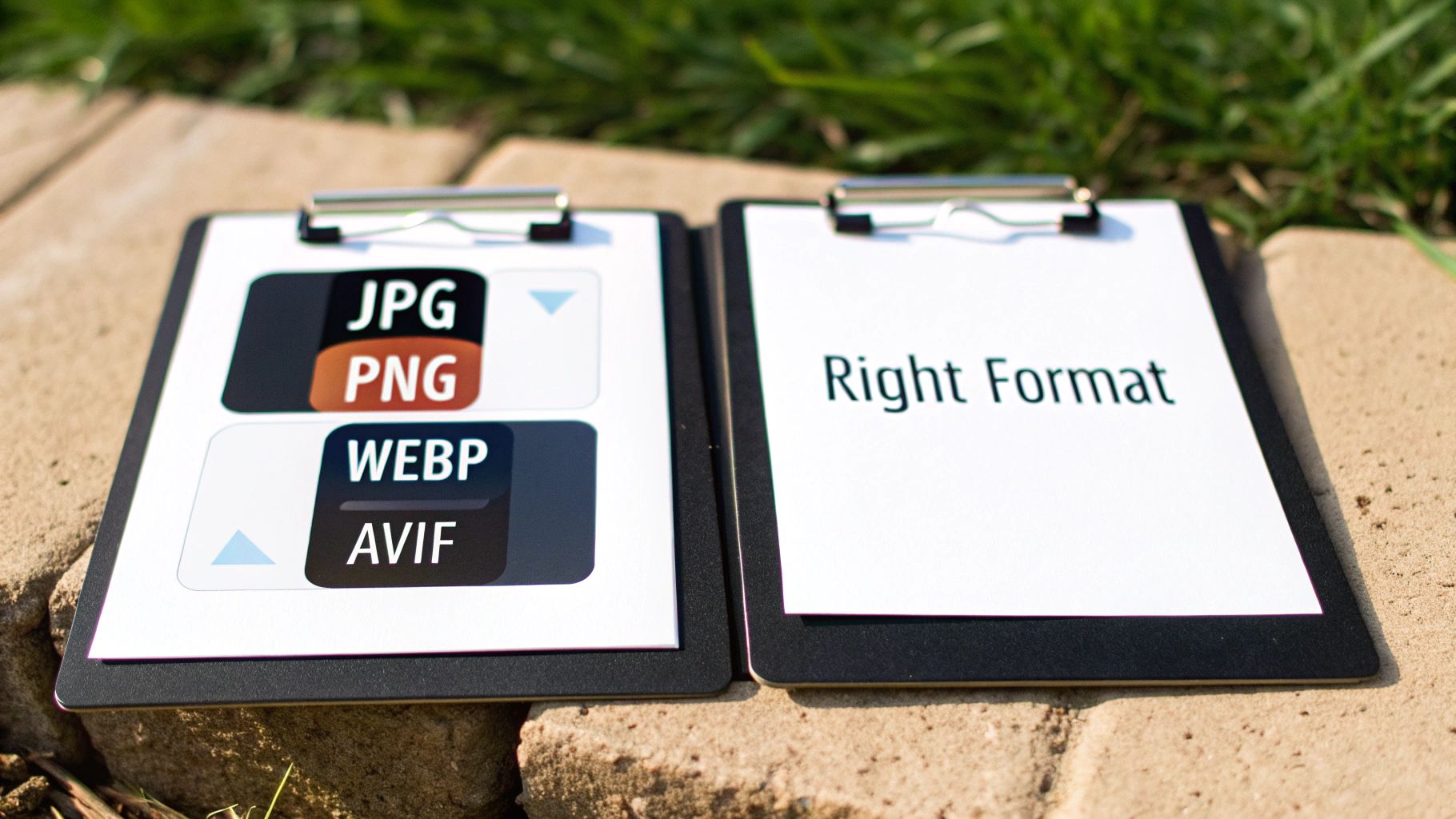
Before you even think about compression or lazy loading, your first decision is choosing the right image format. This is the bedrock of image optimization. Picking the wrong one is like trying to fit a square peg in a round hole—it might work, but it’s going to be messy and inefficient.
Using a massive PNG for a hero photograph adds unnecessary weight to your page, while a JPEG can’t handle the transparency you need for a clean logo. The goal is to match the format to what the image actually is and what you need it to do.
The Classic Contenders: JPEG and PNG
For years, JPEG and PNG were the workhorses of the web, and they definitely still have their place. Knowing when to use each is fundamental.
JPEG (Joint Photographic Experts Group) is your go-to for anything with lots of colors and gradients. Think photographs of people, products, or landscapes. Its “lossy” compression is brilliant at shrinking file sizes by intelligently discarding data the human eye probably won’t miss. This is perfect for those rich, detailed visuals where a tiny, imperceptible dip in quality is a fantastic trade-off for a huge drop in file size.
PNG (Portable Network Graphics), on the other hand, shines exactly where JPEG struggles. Its superpower is transparency. If you have a logo, an icon, or any graphic that needs to sit on a colored background without a clunky white box around it, PNG is your answer. It uses “lossless” compression, which means no data is discarded. This keeps lines sharp and details crisp but at the cost of a much larger file.
Key Takeaway: Use JPEGs for photos. Use PNGs for logos, icons, and anything that needs a transparent background. A common mistake is saving a big photograph as a PNG, which creates a needlessly heavy file.
The Modern Powerhouses: WebP and AVIF
While the classics are reliable, next-gen formats like WebP and AVIF represent a huge leap forward in efficiency. They deliver the same (or better) visual quality at a fraction of the file size.
WebP, created by Google, is the reigning champ for all-around performance. It can produce files that are 25-35% smaller than a comparable JPEG with no visible quality loss. It also handles transparency and even animation, making it a versatile replacement for both JPEGs and PNGs in almost every situation.
AVIF (AV1 Image File Format) pushes the envelope even further. It regularly creates images around 50% smaller than an equivalent JPEG. The compression is so good that it’s quickly becoming the new gold standard for performance-obsessed developers.
The old argument against them was browser support, but that’s largely a thing of the past.
As you can see from this snapshot from Can I Use, support for WebP is practically universal across modern browsers. It’s a safe and incredibly effective choice to make today.
Your Simple Decision-Making Framework
With these options on the table, your strategy should be modern but practical. After all, a great visual experience is one of many website design best practices that depends on fast-loading, high-quality images.
Here’s a quick cheat sheet for making the right call:
- For Photographs & Banners: Your first choice should be WebP. It’s the sweet spot of quality, size, and support. For sites where every kilobyte counts, look to AVIF for even more savings.
- For Logos & Icons with Transparency: While PNG is the old reliable, converting these to WebP will almost always give you a smaller file with the same transparent background.
- For Simple Graphics & Illustrations: For things like charts or diagrams with a limited color palette, WebP is far more efficient than a PNG.
- For Scalable Graphics: When it comes to logos, icons, and illustrations that must look tack-sharp at any size, nothing beats SVG (Scalable Vector Graphics). Because SVGs are just code, they are incredibly tiny and scale perfectly on any screen, from a watch to a billboard.
Mastering Compression Without Ruining Your Images
Once you’ve picked the right format, the next big win is compression. This is where you can shave off the most file size, but you have to be careful. The whole point is to make the file as small as possible without turning your beautiful images into a blurry, pixelated mess.
Think of it like packing a suitcase. You can either fold everything neatly, which is safe but doesn’t save a ton of space. That’s lossless compression. Or, you can use those vacuum-sealed bags that suck all the air out. You’ll fit way more in, but your clothes might come out a little wrinkled. That’s lossy compression.
For the web, we almost always want to use the vacuum bags.
Lossless vs. Lossy Compression
Getting a feel for these two approaches is the key to making smart optimization choices. They both make files smaller, but they get there in completely different ways.
Lossless compression is the “neatly folded” method. It cleverly reorganizes the image data to be more efficient without throwing any of it away. When the browser displays the image, it’s a perfect 1:1 reconstruction of the original. This is great for preserving every last detail, but the savings are pretty modest—usually only 10-20%.
Lossy compression, on the other hand, is how you get those tiny file sizes. It permanently deletes bits of data the algorithm decides are non-essential, targeting information the human eye isn’t likely to miss. This is where you see jaw-dropping reductions of 50-80% or even more. The trick is finding the right balance so nobody ever notices the “wrinkles.”
Finding the Sweet Spot: For web performance, lossy compression is your best friend. Those massive file size savings translate directly into faster page loads. Your job is to find that perfect balance where the file is tiny, but the quality still looks sharp.
How to Find That Perfect Compression Balance
If you get too aggressive with compression, you end up with nasty visual glitches called “artifacts.” You’ll start seeing blocky squares, fuzzy edges, or weird color banding. Nobody wants that.
For formats like JPEG and WebP, this is usually controlled with a quality setting from 0-100.
- 90-100 Quality: Looks fantastic, but the files are still pretty chunky. Overkill for most web uses.
- 70-85 Quality: This is the magic range for most images on the web. You get a huge drop in file size with almost no noticeable dip in quality.
- 50-69 Quality: Can be okay for smaller images or when speed is the absolute top priority, but you might start to see some slight degradation if you look closely.
- Below 50: Tread very, very carefully here. This level of compression often introduces obvious artifacts and should only be used in extreme cases where file size is the only thing that matters.
My go-to strategy is to start at a quality level of 80 and look at the result. Put it side-by-side with the original. Can you tell the difference? If not, try nudging it down to 75. Keep going until you see a visible drop in quality, then just bump it back up one step. That’s your sweet spot.
Our Favorite Image Compression Tools
You don’t need to be a Photoshop pro to nail your image compression. There are a ton of incredible tools out there, from simple web apps to powerful desktop software. Picking the right one just depends on your workflow. This is a core part of understanding why speed matters, as we break down in our guide on how slow websites can impact your business.
Here are a few of our team’s top picks.
For Quick and Easy Online Compression
- TinyPNG / TinyJPG: This is the undisputed champion of simplicity. Just drag your images onto the page, and its smart lossy compression works its magic. It’s free, fast, and my first stop when I only have a few images to crunch.
- Squoosh: A brilliant browser-based tool from Google that gives you a live, side-by-side preview. You can slide the quality setting and instantly see the result, which makes finding that perfect balance incredibly intuitive.
For Advanced Control and Batch Processing
- ImageOptim (Mac): If you’re on a Mac, this free, open-source app is a must-have. It runs multiple compression algorithms on your images to squeeze out every last byte without hurting quality. It’s perfect for processing a whole folder of images at once.
- JPEGmini (Mac & Windows): This paid tool is a favorite among photographers for a reason. Its patented tech can reduce file sizes by up to 80% with virtually no visible difference. It also has handy plugins for Adobe Lightroom and Photoshop, making it great for a professional workflow.
By picking the right compression type and using one of these tools, you can confidently shrink your image files and make a huge leap toward a faster website.
Making Your Images Work Smarter, Not Harder
You’ve picked the perfect format and nailed your compression settings. Now comes the part that truly separates a fast site from a frustratingly slow one: serving those images intelligently. Just dumping a single, large image onto a page and letting the browser shrink it for phones is one of the most common performance blunders I see. It’s a huge waste.
Think about it—forcing a tiny phone screen to download a massive desktop-sized image is like making someone drink from a fire hose. It might look okay in the end, but the user is stuck waiting for a huge file they don’t need, burning through their mobile data. This is where responsive images and smart loading techniques come in to save the day.
This whole process is about taking a great original image and making it lean and efficient for the web.
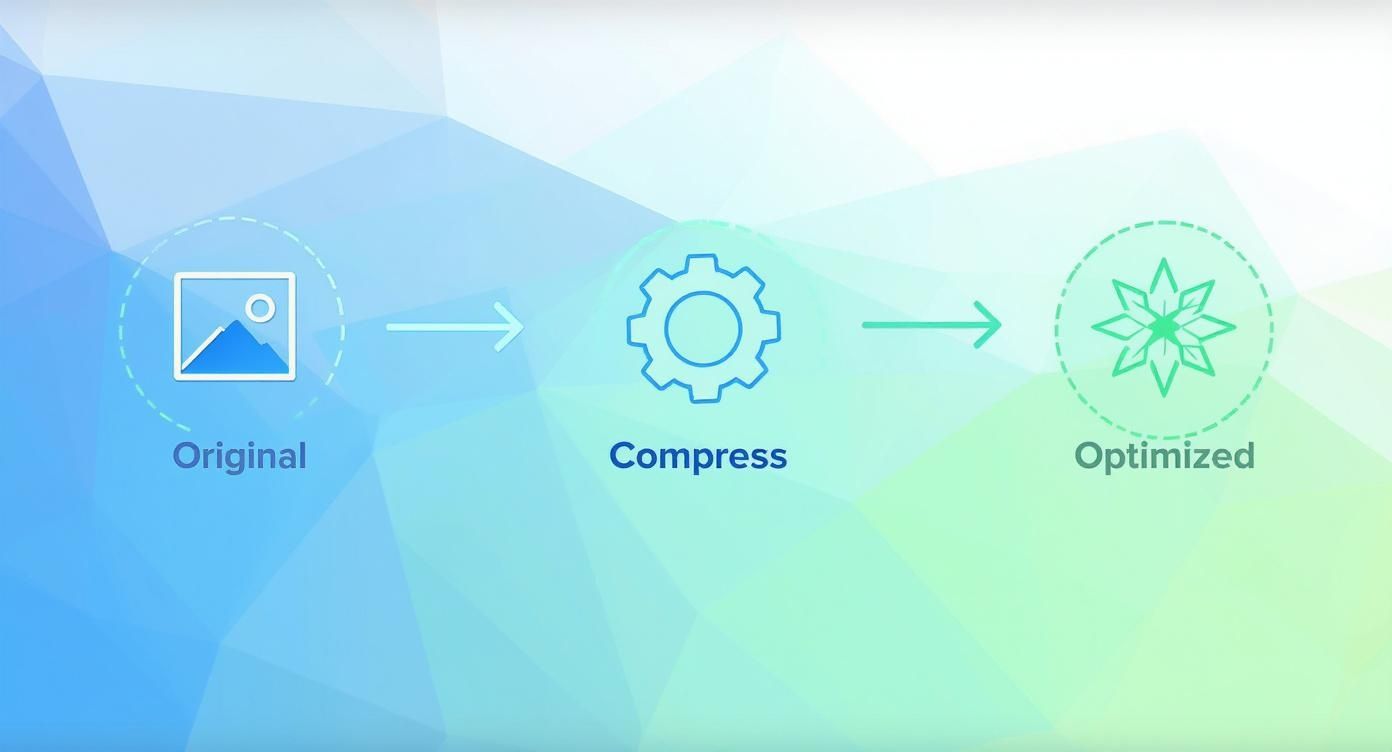
Starting with the original, applying smart compression, and ending with an optimized version—that’s the core loop for a faster website.
Truly Responsive Images with srcset and sizes
To kill the “one-size-fits-all” problem, we use the srcset and sizes HTML attributes. These two attributes are your best friends for responsive design. They upgrade a standard <img> tag, giving the browser a menu of image sizes to choose from instead of just one. The browser then gets to pick the most efficient option for its current screen size and resolution.
Here’s how they work together:
- The
srcsetattribute is a comma-separated list of different image files and their actual widths (e.g.,image-small.jpg 400w). - The
sizesattribute acts like a guide, telling the browser how much space the image will actually fill on the screen at different viewport sizes (e.g.,(max-width: 600px) 100vw).
Let’s look at a real-world example:

This snippet is incredibly powerful. The srcset offers three different versions of the flower image. The sizes attribute tells the browser, “Hey, on screens 600px or smaller, this image will be full-width. On anything bigger, it’ll only take up half the screen.”
Armed with this info, a phone with a 400px wide screen grabs the tiny flower-small.jpg. A tablet displaying the image at 800px wide will download flower-medium.jpg. This is an absolute game-changer for performance and a non-negotiable part of any serious effort to optimize a website for mobile devices.
The Magic of Lazy Loading
Responsive images solve which image to load. Lazy loading solves when to load it.
By default, a web browser is a bit too eager—it tries to download every single image on a page right away, including the ones way down at the bottom that a visitor might never even see. This is a massive drain on initial load time.
Lazy loading flips the script. It tells the browser to hold off on loading images until the user actually scrolls near them.
Implementing lazy loading can give you a huge boost in your initial page load speed and your Largest Contentful Paint (LCP) score, which is a major factor in Google’s Core Web Vitals. The browser gets to focus on what’s visible first, creating a much snappier experience.
How to Implement Native Lazy Loading
The best part? This used to require complicated JavaScript, but now it’s built right into HTML. All you need is a single attribute: loading="lazy".

That’s it. Adding that one attribute tells any modern browser to automatically defer loading that image until it’s needed. It’s easily one of the highest-impact optimizations you can make for the amount of effort involved.
When you combine a well-structured srcset with loading="lazy", you’ve created a performance powerhouse. You’re not just serving smaller images; you’re serving them at the perfect moment. This is how you build a fast, smooth experience that keeps users happy and engaged.
Boosting SEO and Accessibility with Smart Image Tactics
While fast load times are a massive win, truly optimized images do so much more. They open up your content to a wider audience, including search engines and users with visual impairments. These elements work together, turning your visuals from simple decorations into powerful assets for SEO and accessibility.
It’s all about giving every image a clear purpose that both machines and people can understand. A well-described image helps a screen reader narrate your page to a visually impaired user, and that same description provides crucial context to Google’s crawlers, helping them figure out what your content is about.
Crafting Alt Text That Actually Works
Alternative text, or alt text, is hands-down the most important piece of the SEO and accessibility puzzle for images. Its main job is to describe an image for someone who can’t see it. As a bonus, it also gives search engines a strong signal about the image’s content and how it relates to the surrounding text.
So many people get this wrong. Avoid these common mistakes:
- Keyword Stuffing:
alt="buy running shoes best running shoes cheap running shoes"is just spam. It’s unhelpful and looks bad. - Vague Descriptions:
alt="shoe"tells nobody anything useful. - Leaving it Blank: This is a huge missed opportunity for both accessibility and SEO.
Instead, be descriptive and concise. A great rule of thumb is to imagine you’re describing the image over the phone. For a picture of a product, something like alt="Pair of blue Nike Air Zoom Pegasus running shoes on a white background" is perfect. It’s helpful, accurate, and naturally includes relevant keywords.
To help you nail this every time, here’s a quick-reference guide showing what works and what doesn’t.
Alt Text Do’s and Don’ts
| Image Type | Good Alt Text Example (Descriptive & SEO-Friendly) | Bad Alt Text Example (Generic or Keyword-Stuffed) |
|---|---|---|
| Product Photo | alt="A black Anker PowerCore 10000 portable battery charger" |
alt="charger" or alt="power bank portable charger buy now" |
| Informative Chart | alt="Bar chart showing a 45% increase in organic traffic in Q3 2024" |
alt="chart" |
| Team Photo | alt="The Raven SEO team smiling in their Baltimore office" |
alt="team photo" |
| Action Shot | alt="A mountain biker navigating a rocky trail in Patapsco Valley State Park" |
alt="biker" or alt="mountain bike biking trail bicycle" |
Getting alt text right is a small habit that delivers big returns in user experience and search visibility.
Why Your File Names Matter So Much
Even before you upload an image, you have a chance to score an easy SEO win with its file name. Search engine crawlers read file names for context, and a descriptive name is far more valuable than the generic gibberish a camera spits out.
Put yourself in a crawler’s shoes. A file named IMG_8765.jpg provides zero information. In contrast, a file named blue-nike-running-shoe.jpg immediately tells Google what the image is about, reinforcing the keywords you’re targeting on the page. This simple habit adds another layer of semantic relevance that supports your content.
Your file name is the first clue you give a search engine about an image’s subject matter. Make it count by using descriptive, keyword-rich names separated by hyphens. This is a foundational step in any solid strategy for improving your website’s visibility through images and SEO.
Going Deeper with Sitemaps and Structured Data
Ready to give search engines the best possible roadmap to your visual content? It’s time to look at more advanced tools like image sitemaps and structured data.
An image sitemap is a separate file that lists all the images on your site, helping Google discover and index visuals it might otherwise miss during a routine crawl.
Structured data (using Schema.org markup) lets you add even more context. For a product image, you can explicitly label it as a product, then link it to details like price, brand, and reviews. This rich information can help your images show up in Google’s rich results, like product carousels, which drives highly qualified traffic.
These tactics are critical when you realize that image search accounts for a staggering 22.6% of all search queries on Google. With that kind of volume, optimizing for discovery isn’t optional. When done right, this level of optimization can boost PageSpeed scores by 30-40% and improve all three Core Web Vitals metrics.
On top of this, understanding and managing the data baked into your image files is a key component of smart image tactics. For those interested in the technical details, this guide on finding image metadata is a fantastic resource.
Common Questions We Hear About Image Optimization
Even with a solid game plan, you’re bound to run into some specific questions once you start putting these techniques into practice. The world of image optimization isn’t always black and white, and real-world scenarios often throw a wrench in the works.
This section tackles some of the most common challenges and sticking points we see people encounter. Let’s clear up any lingering confusion so you can handle any image optimization task that comes your way with confidence.
What Is the Best All-Around Image Format Today?
For just about everything on the web today, WebP is the clear winner. It provides fantastic compression, often making files 25-35% smaller than a comparable JPEG without sacrificing quality. Plus, it supports transparency and animation, making it incredibly versatile.
With nearly every modern browser supporting it, WebP has become a safe, high-performance default.
The newer AVIF format is even more powerful, but its browser support isn’t quite universal yet. A great strategy is to use the <picture> element to serve WebP first, with a classic JPEG or PNG as a fallback. That way, everyone gets a fast experience. And for simple graphics like logos and icons that need to scale flawlessly? SVG is still the undisputed king.
Expert Insight: It’s time to move past the old JPEG vs. PNG debate. Adopting a “WebP first” mentality is one of the fastest ways to shave seconds off your load time. Those file size savings add up and have a direct, positive impact on your Core Web Vitals.
Can I Over-Compress My Images and How Do I Know When to Stop?
Absolutely. Over-compression is a classic mistake, and it leads to some nasty visual artifacts—that ugly blockiness, weird color banding, or blurry edges you sometimes see. These glitches can make a beautiful website look cheap and unprofessional in a hurry.
The goal is to find that compression “sweet spot,” the perfect balance between the smallest possible file size and pristine visual quality.
For JPEGs and WebP images, that sweet spot is usually a quality setting between 60 and 80. The best way to check your work is a simple side-by-side visual test. Put the original next to your compressed version. If you can’t tell the difference at a normal glance, you’ve nailed it.
Tools like Squoosh are perfect for this, since their live preview sliders let you see the changes in real-time. Always aim for the biggest file size reduction with no visible drop in quality.
How Do I Optimize Images for a WordPress or Shopify Site?
This is where it gets easy. Both WordPress and Shopify have a massive ecosystem of plugins and apps that automate nearly all of the heavy lifting. This is, without a doubt, the most efficient way to manage image optimization without turning it into a manual chore.
- For WordPress: Check out plugins like Imagify, Smush, or ShortPixel. These are brilliant because they can automatically compress images on upload, generate multiple sizes for responsive delivery (
srcset), and even convert everything to the speedy WebP format. Most can also go back and optimize your entire existing media library. - For Shopify: While the platform does some basic optimization out of the box, dedicated apps from the Shopify App Store give you far more control. Tools like Crush.pics or TinyIMG let you dial in custom compression levels, optimize your alt text for SEO, and clean up filenames for a serious performance boost.
Using these platform-specific tools is how you make image optimization a sustainable, “set it and forget it” part of your routine. They ensure every single image you add helps make your website faster and better.
Optimizing images is a critical step in building a high-performing website that ranks well and converts visitors. If you need expert help turning your website into a powerful growth engine, the team at Raven SEO is ready to create a strategy that aligns with your goals. Contact us today for a no-obligation consultation and let’s build something exceptional together.