Before you touch a single design element or write one word of copy, the most important work of landing page optimization has already begun. This is the strategy phase, and skipping it is the number one reason most landing pages fail.
Too many businesses jump straight into the fun stuff—picking colors and images—only to wonder why their beautiful page isn’t bringing in leads. The problem almost always comes down to a lack of focus. This guide is designed to be educational and easy to read, giving you actionable steps to improve your results.
Setting the Stage for High-Converting Landing Pages
A great landing page isn't a jack-of-all-trades. It’s a specialist. It has one job and one job only: to get a visitor to take a single, specific action. This is the core of the ‘one page, one goal’ philosophy that drives every successful campaign. When you try to do too much, you accomplish nothing.

Defining Your Page's Single Objective
So, what is the one thing you want a visitor to do? This question isn't a suggestion; it's a requirement. The answer has to be crystal clear before you move an inch further, because ambiguity is the absolute enemy of conversion.
Your objective will typically fall into one of these buckets:
- Lead Generation: Getting an email in exchange for a high-value asset like an ebook, a webinar seat, or a newsletter subscription.
- Direct Sale: Convincing someone to buy a specific product, whether it’s a new software tool or a ticket to an online workshop.
- Booking a Consultation: Getting a qualified prospect to schedule a demo or a sales call with your team.
Think about it this way: if a Baltimore roofing company creates a landing page for its emergency storm repair service, its only goal should be getting a frantic homeowner to call or fill out an urgent request form. That page shouldn't be cluttered with links to their blog or social media profiles. Every single element must point toward that one crucial action.
A polished, professional landing page can improve your conversion rates. And a messy one can hurt them. High-converting landing pages are built on a foundation of a single, clear goal.
Understanding Your Ideal Customer
Once your goal is locked in, you need to get laser-focused on who you're talking to. "Small business owners" is way too broad. You have to go deeper. To really nail the design and copy, you first have to understand the core principles behind how to design landing pages that actually convert.
This means getting specific enough to know their real pain points, what motivates them, and the exact language they use.
Instead of targeting "small business owners," you should be targeting "marketing managers at Maryland-based tech startups with 10-50 employees who are struggling to generate qualified leads." See the difference? That level of detail lets you craft a message that feels like it was written just for them. Our guide on how to create buyer personas is a great resource for this process. A solid persona helps you answer the critical questions that will shape every decision you make for the page.
Crafting Copy That Connects and Converts
Let's be honest: your landing page's success comes down to its words. Great copy does more than just describe what you're selling. It connects, persuades, and guides visitors to take that one specific action you want them to take. Think of it as the engine powering your conversion machine, turning casual browsers into committed customers.
The biggest challenge? You've only got a few seconds to grab someone's attention. This is why your headline is, without a doubt, the most important piece of copy on the entire page. It has to instantly speak to your visitor’s core problem or desire, making it crystal clear they've landed in the right place.
Writing Headlines That Grab Attention
A powerful headline is the difference between a visitor sticking around to learn more or immediately hitting the back button. Generic, boring statements just won't cut it. Instead, you need to lean on proven formulas that resonate with what your audience actually needs. The goal is to be clear, compelling, and laser-focused on the benefits.
Your headline and subheadline should work together like a one-two punch. The headline hooks them, and the subheadline provides just enough extra context or clarifies the main benefit, encouraging them to keep reading.
Headline Formulas for Higher Engagement
To help you move beyond generic statements, here's a look at a few proven headline formulas that work exceptionally well on landing pages.
| Formula Type | Example Headline | Best Used For |
|---|---|---|
| The "How-To" Headline | How to Double Your Leads Without Increasing Your Ad Spend. | Promising a clear, actionable solution to a common problem. |
| The "Benefit-Driven" Headline | Get Flawless SEO Reports in Under 60 Seconds. | Focusing on the ultimate positive outcome or time-saving advantage. |
| The "Question" Headline | Are You Paying Too Much for Home Insurance? | Engaging visitors directly by asking a relatable question they want answered. |
These formulas provide a solid starting point for crafting headlines that are designed to stop the scroll and pull your ideal customer in.
Articulating Your Unique Value Proposition
Beyond the headline, the rest of your page needs to scream your Unique Value Proposition (UVP). This is the simple, concise statement that answers one critical question: "Why should I choose you over all the other options?"
Your UVP isn't just a catchy slogan; it's the very core of your offer. For a company like Raven SEO, a UVP might be "Data-Driven SEO Strategies for Maryland Businesses That Deliver Measurable Growth." For a local Baltimore brewery, it could be "Baltimore's Freshest Small-Batch Beer, Delivered Right to Your Door." A strong UVP makes your offer feel like the only logical choice.
You can see more powerful ad copy examples in our guide to see how a strong value proposition can be articulated.
Building Trust with Social Proof
Words are powerful, but let’s face it, people are naturally skeptical of marketing claims. This is where social proof becomes your secret weapon. It’s the real-world evidence from other people that your product or service is credible and actually delivers on its promises.
You can build this trust by strategically placing a few key elements throughout your page:
- Authentic Testimonials: Use quotes from real customers that highlight specific, tangible results. Adding their name, company, and photo makes them feel much more genuine.
- Case Studies: A short summary of a customer's success story can be incredibly persuasive, showing potential customers what’s possible for them.
- Trust Badges and Logos: Displaying security seals, industry awards, or the logos of well-known clients instantly boosts your credibility without you having to say a word.
Your goal is to dismantle skepticism before it even has a chance to form. By showing that real people and reputable organizations already trust you, you make it much easier for new visitors to do the same.
Imagine you're running a small e-commerce business in Baltimore. You're pouring money into Google Ads, but your landing pages are converting at a dismal 2.35%—the low end of the industry average. Data shows that businesses willing to ruthlessly remove distractions, like navigation menus, can double their conversions. One study found that pages with just one link converted at 13.5%, while pages with five or more links converted at only 10.5%.
For Raven SEO's audience of Maryland SMBs, this is a powerful lesson. It means testing a single, bold CTA like 'Book Your Free Consultation' on a page with no headers or footers pulling the visitor's eyes away from the main goal. Focus is everything.
Designing a Frictionless User Experience
A great landing page isn't just a collection of headlines and images. It's a carefully choreographed journey, designed to guide a visitor toward a single, decisive action.
Your design and layout choices are the invisible hand that moves them along this path. When you get it right, the experience feels so natural that the user doesn't even notice the mechanics behind it—they just feel compelled to act. That's the heart of a frictionless user experience.
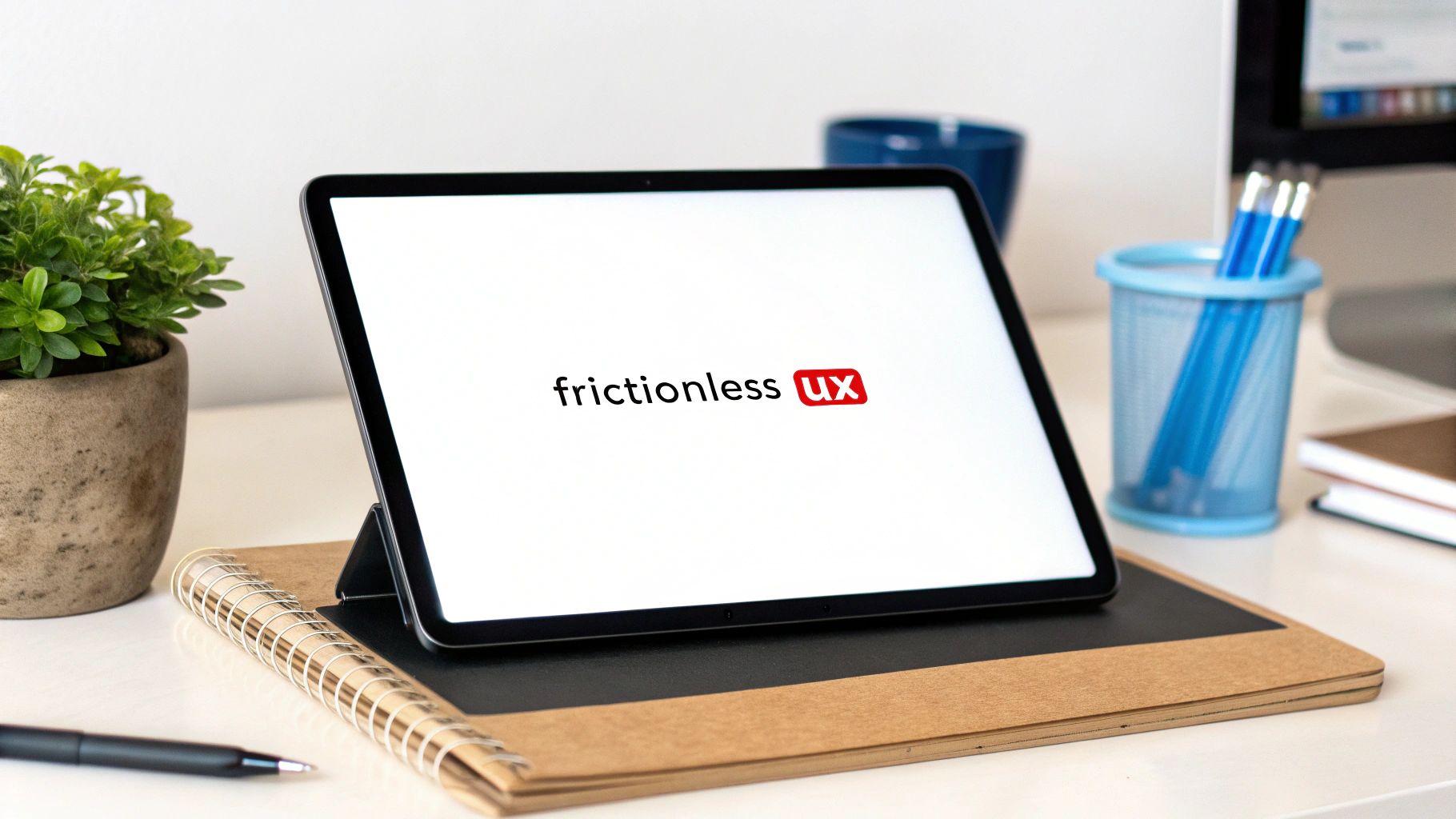
This journey starts with creating a clean, uncluttered environment. One of the biggest mistakes I see is businesses treating a landing page like a regular webpage, complete with a full navigation menu, sidebars, and footer links. Every one of those links is an escape hatch, a potential exit from the conversion path you’ve built.
Removing them is often the single most impactful design change you can make. The goal is to eliminate distractions and keep the visitor’s focus locked on the prize.
Mastering Visual Hierarchy
Visual hierarchy is the art of arranging elements to show their order of importance. It’s how you tell a visitor’s eyes where to look first, second, and third. A strong hierarchy makes your most important element—the call-to-action (CTA)—impossible to miss.
You can establish this hierarchy using a few key design principles:
- Size: Larger elements naturally draw more attention. Your headline should be the biggest text on the page, and your CTA button should be prominently sized.
- Contrast: A bright, contrasting color for your CTA button makes it pop. If your page uses a lot of blues and whites, an orange or green button will stand out instantly.
- Negative Space: This is just the empty space around your elements. Generous use of negative space around your CTA and form makes them feel less crowded and more important.
Think of your landing page like a spotlight on a stage. The headline, key benefits, and CTA should be brightly lit in the center, while everything else fades into the background.
Crafting a Compelling Call to Action
Your CTA is the climax of your landing page. Seriously, the words you use on that button can make or break your conversion rate. A generic, uninspired word like ‘Submit’ is a massive missed opportunity. It’s passive, boring, and focuses on what the user has to give (their info) rather than what they're going to get.
The best CTAs are action-oriented, specific, and communicate a clear benefit. They create a sense of urgency and excitement, making the click feel like the next logical step in achieving a goal.
Instead of 'Submit', try using copy that completes the phrase "I want to…":
- I want to… Get My Free SEO Audit
- I want to… Claim My 20% Discount
- I want to… Start My 14-Day Free Trial
This small shift in language frames the action from the user’s perspective, making it far more persuasive. A great user experience is also tied to your site's overall structure; you can learn more about how simple navigation wins customers and boosts SEO in our dedicated guide.
Optimizing Forms to Reduce Friction
If your landing page goal is lead generation, the form is where the magic happens—or where it all falls apart. User frustration with forms is a primary cause of page abandonment. The key is to make the process of providing information feel as effortless as possible.
The golden rule is simple: only ask for what you absolutely need. Every additional field you add increases friction and gives the user another reason to leave. If all you need is an email to send a downloadable guide, don't ask for their phone number, company name, and job title.
For situations where more information is necessary, consider using a multi-step form. This breaks a long form into smaller, more manageable chunks. Asking for just a name and email on the first step feels way less intimidating.
Once the user has committed to that first small step, they are psychologically more likely to complete the rest. It turns a daunting task into a simple, step-by-step process, which can significantly reduce user friction and boost your completion rates.
Boosting Performance with Technical SEO and Speed
So far, we’ve covered the persuasive side of your landing page—the copy, design, and user journey. But even the most brilliant page will fall flat if it’s sluggish or invisible to search engines.
This is where the technical foundation comes in. It’s all about making sure your page performs just as well behind the scenes as it does on the screen.
Great design and compelling copy mean absolutely nothing if a visitor bounces before the page even loads. In today’s world, page speed isn't just a recommendation; it’s a critical conversion factor. Slow pages frustrate users, send bounce rates soaring, and can tank your search rankings.
Why Every Second Counts
Let's talk speed, because when it comes to landing pages, every second literally costs you money. The data is clear: each additional second of load time can slash conversions by a staggering 7%.
The critical threshold for user patience? Just two seconds.
For Raven SEO's eCommerce and professional services clients here in Maryland, this is a huge deal. We often see mobile traffic driving the majority of visits but showing lower conversion rates. A big reason is that nearly half of all visitors (45-48%) will ditch a page if they have to wait longer than three seconds.
The takeaway is simple: a lightning-fast page paired with a powerful call-to-action is a non-negotiable formula for growth.
So, how do you speed things up? You don't need to be a developer to make a huge impact.
Compress Your Images: Large, unoptimized images are one of the biggest speed killers. Use tools like TinyPNG or Squoosh to shrink file sizes without sacrificing visual quality. Choosing the right file type is also a game-changer. You can find some excellent guidance on the best image format for web performance.
Leverage Browser Caching: Caching tells a visitor's browser to store parts of your page, like images and CSS files. When they come back, the page loads much faster because their browser doesn't have to re-download everything. Many WordPress plugins, like W3 Total Cache, can handle this for you in just a few clicks.
These speed optimizations tie directly into Google's core performance metrics. To get a better handle on this, you can learn more about Core Web Vitals in our article and see how they influence user experience and rankings.
On-Page SEO for Landing Pages
While many landing pages are built for paid campaigns, optimizing them for organic search can open up a long-term stream of free, relevant traffic. This doesn't mean a complete SEO overhaul. Just focusing on a few key on-page elements can make a world of difference in how Google sees—and ranks—your page.
The goal here is to send crystal-clear signals to search engines about your page's purpose, making it easier for them to show it to the right people.
Think of your title tag and meta description as the ad copy for your organic search result. They are your first and only chance to earn a click from a potential customer scrolling through Google.
To help you get everything in order, I've put together a quick checklist covering the essential technical elements for any landing page. Think of this as your pre-flight inspection before you launch.
Technical SEO Checklist for Landing Pages
A step-by-step checklist of technical elements to review and optimize for better performance and search visibility.
| Technical Element | Key Action | Impact on Conversions |
|---|---|---|
| Title Tag | Write a compelling title (under 60 characters) that includes your primary keyword and a clear benefit. | A strong title improves click-through rates from search results, bringing more qualified traffic to your page. |
| Meta Description | Craft a persuasive summary (under 160 characters) that expands on the title and includes a call to action. | While not a direct ranking factor, a good meta description entices users to click, increasing traffic. |
| Mobile-First Design | Ensure your page is fully responsive and provides an excellent experience on smartphones and tablets. | With the majority of traffic coming from mobile, a poor mobile experience is a direct path to lost conversions. |
| URL Structure | Create a clean, descriptive URL that is easy to read and includes your main keyword (e.g., /free-seo-audit). | A simple URL structure helps both users and search engines understand the page's content at a glance. |
By checking these technical boxes, you’re not just making Google happy. You’re building a faster, more accessible, and more effective landing page for every single visitor. That superior experience leads directly to better performance and more conversions. It’s as simple as that.
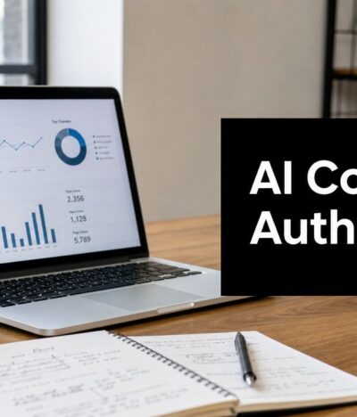
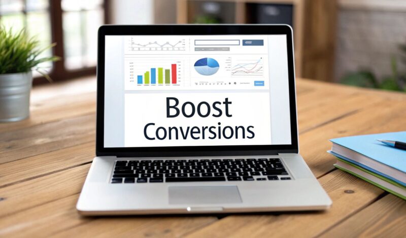
Using Data to Test and Iterate Your Way to Success
Launching a landing page is just the starting line. The real wins come when you stop guessing what works and start letting your visitors tell you through their actions. Landing page optimization isn't a one-and-done task; it’s a constant cycle of testing, learning, and refining based on what the data shows. This is how you turn raw numbers into actionable insights that fuel real growth.
The whole process kicks off with solid tracking. Without data, you're flying blind. Tools like Google Analytics are indispensable for seeing exactly what people do on your page—where they click, how long they stick around, and where they bail. This information is the bedrock of your entire strategy, helping you find the friction points and spot opportunities for improvement.
Forming a Strong Hypothesis
Once you can see what users are doing, you can start making educated guesses about how to make their experience better. This is your hypothesis. A good hypothesis isn't just a vague idea; it's a specific, measurable, and testable statement about a change you believe will produce a precise result.
For example, a weak hypothesis is something like: "A new button color might work better." Not very helpful, is it?
A strong hypothesis, on the other hand, is laser-focused: "Changing our primary CTA button from the current blue to a high-contrast orange will increase form submissions by 10% because it will stand out more against the page background."
See the difference? This structure (Change + Expected Outcome + Rationale) gives your test a clear purpose and a defined metric for success. To really get a handle on what your audience is up to, you can get some powerful insights by understanding key reports in Google Analytics 4.
Prioritizing Your A/B Tests
With a solid hypothesis ready to go, it’s time to put it to the test with A/B testing, sometimes called split testing. This is where you create two versions of your page: the original (Version A, the "control") and a variation with your proposed change (Version B, the "challenger"). You then split your traffic between the two to see which one performs better.
So, where do you start for the biggest impact? Focus on the elements that have the most sway over a user's decision-making process.
- The Headline: This is the first thing people read. Try testing different benefits, emotional hooks, or value propositions.
- The Call to Action (CTA): Experiment with the button copy ("Get My Free Quote" vs. "Start Now"), color, size, and even its placement on the page.
- The Hero Image or Video: Your main visual sets the tone. Test a clean product shot against an image of someone actually using the product.
- Form Length: This is a big one. Does asking for just an email convert better than a form asking for a name, email, and phone number? Test it.
- Social Proof: Try different placements or formats for testimonials. Do video testimonials crush text-based quotes? There's only one way to find out.
A/B testing takes ego and office politics out of the equation. It doesn’t matter what your team thinks will work better; the only thing that matters is what the data proves.
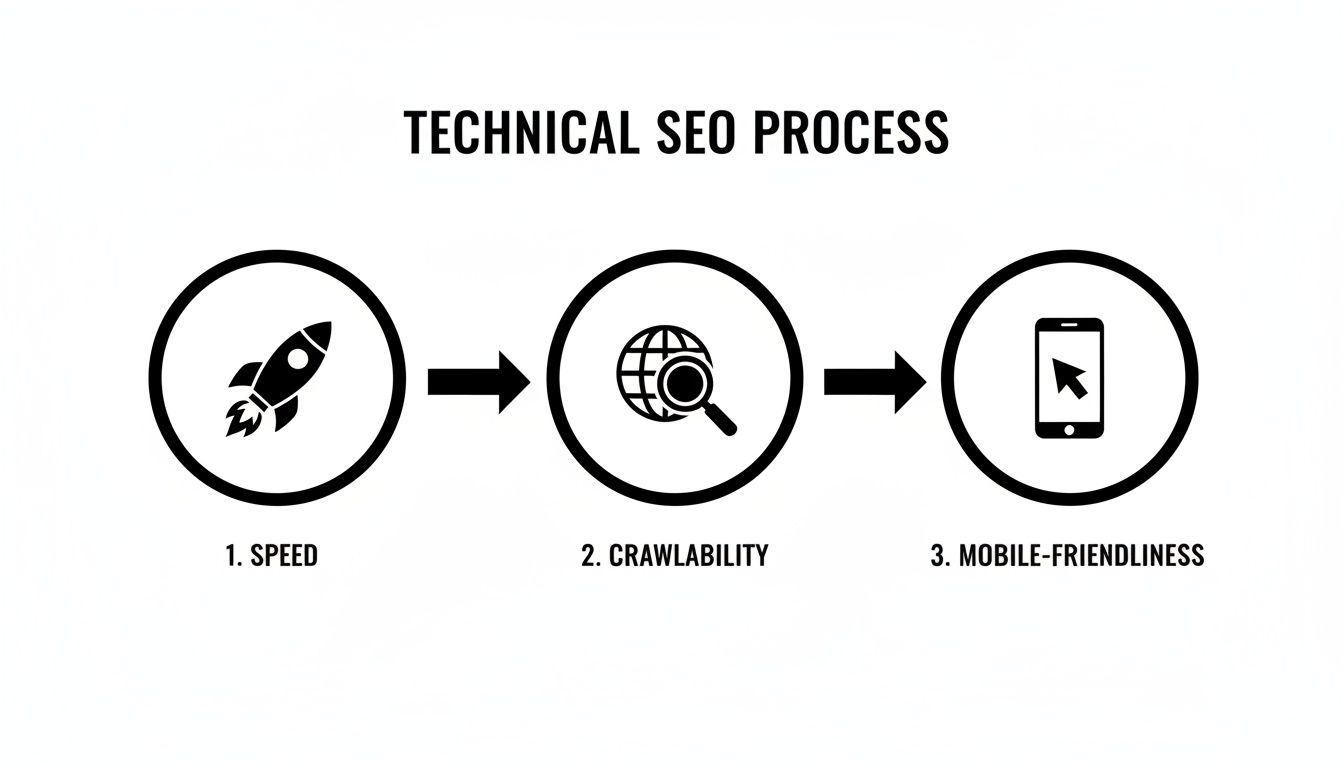
As you test, remember to keep an eye on the technical fundamentals. This diagram highlights the core areas—speed, on-page SEO, and mobile-friendliness—that can also impact your results.
Analyzing the results gives you a clear path forward, ensuring every tweak you make is a measurable step toward better performance. This iterative loop of hypothesizing, testing, and analyzing is how you consistently turn more of your visitors into loyal customers.
Answering Your Top Landing Page Questions
As you start fine-tuning your landing pages, you're bound to run into a few questions. This is completely normal. Our team at Raven SEO has put this section together to tackle some of the most common ones we hear, giving you quick, straightforward answers you can put to use immediately.
Think of it as a quick-reference guide to cut through the clutter and get right to what moves the needle.
How do you optimize a landing page for SEO?
Optimizing a landing page for SEO involves several key steps. Start with a clear, keyword-focused URL. Write a compelling title tag (under 60 characters) and meta description (under 160 characters) that include your target keyword. Ensure your page loads quickly by compressing images and leveraging browser caching. Finally, design for a mobile-first experience, as most users will find your page on a smartphone.
Should I Put a Navigation Menu on My Landing Page?
For almost every dedicated landing page, the answer is a hard no. Your navigation menu is the mortal enemy of a focused conversion goal. Every link you offer—whether it's to your "About Us" page, your blog, or your social profiles—is an escape hatch. It's a tempting exit for a visitor you've worked hard to get there.
By stripping away the navigation, you eliminate distractions and forge a single, clear path for your visitor to follow. This one simple tweak has been proven time and again to boost conversion rates by keeping people focused on the one thing you want them to do: convert.
How Many Fields Should My Form Have?
The golden rule for forms is simple: ask for as little as you possibly can. Every single field you add is another bit of friction, another tiny reason for a potential lead to just give up and leave. It’s a constant balancing act between your team's need for data and the user's desire for a quick, painless experience.
Start with the absolute bare minimum. If you're offering a downloadable guide, an email address is probably all you really need to deliver it.
If your sales team needs more info to qualify leads, don't just dump a massive form on your visitors. Try one of these approaches instead:
- Use multi-step forms: Break a longer form into smaller, more manageable chunks. Asking for a name and email on the first step feels a lot less intimidating than staring down a form with seven fields.
- Try progressive profiling: If you're using marketing automation software, this is a great feature. It allows you to ask for different pieces of information each time a known contact interacts with a form, gradually building a richer profile without overwhelming them in one go.
How Long Until I Get A/B Testing Results?
The time it takes to get trustworthy A/B test results boils down to one critical factor: traffic volume. A page that gets thousands of visitors a day might gather enough data to reach statistical significance in just a few days. On the flip side, a lower-traffic page could take several weeks, or even a month, to get a clear winner.
The biggest mistake you can make is calling a test too early based on incomplete data. You have to run it long enough to get a large enough sample size for a confident result. Most good A/B testing tools will even tell you when you've hit that point, stopping you from acting on what might just be random luck. A little patience here is what separates smart, data-driven decisions from shots in the dark.
Ready to stop guessing and start converting? The team at Raven SEO specializes in creating and optimizing high-performing landing pages that turn clicks into customers. We combine data-driven strategy with compelling design to build pages that deliver measurable results for Maryland businesses. Schedule your no-obligation consultation today and let's build a landing page that works as hard as you do.