
Getting more customers to buy from your store isn't about guesswork. It’s an educational process of finding where people get stuck, figuring out why, and methodically testing improvements on your key pages—product, cart, and checkout—to make the buying journey as smooth as possible.
Your Starting Point: A Practical CRO Audit
Before you can boost your ecommerce conversion rate, you need to know exactly where you stand. Jumping straight into A/B testing button colors or rewriting headlines without understanding the real problems is like trying to fix a car without popping the hood.
A practical Conversion Rate Optimization (CRO) audit is your diagnostic tool. It turns raw analytics data into a clear, actionable roadmap, showing you the story of how real people interact with your store. This educational approach helps you make informed decisions. For more foundational strategies, this comprehensive guide on how to improve ecommerce conversion rates is a great place to start.
Finding Your True Baseline
The first goal is to establish benchmarks. Don't just settle for your site-wide conversion rate; you need to dig deeper and slice up the data to see the hidden patterns.
- Conversion Rate by Device: Is there a huge gap between desktop, mobile, and tablet? A high mobile cart abandonment rate almost always points to a clunky mobile checkout experience.
- Conversion Rate by Traffic Source: Are visitors from your paid social campaigns actually buying, or just browsing and bouncing? Knowing which channels bring motivated buyers helps you spend your marketing dollars more effectively.
- New vs. Returning Visitors: If returning customers are converting at a much higher rate, it might mean your initial user experience is confusing the heck out of first-time visitors.
Drilling down into traffic sources is a must. The numbers don't lie: conversion rates are rarely the same across the board. Organic search typically leads the pack at around 3.1%, with email following closely at 3.0%. Paid search and social media trail at 2.7% and 2.4%, respectively. These differences prove you need to attract qualified traffic and treat each channel a little differently.
Pinpointing User Drop-Off Points
Once you know who is converting, the next step is finding out where they're leaving. This is where a funnel analysis in a tool like Google Analytics becomes your best friend.
By mapping out the typical customer journey—from the homepage to a category page, then a product page, to the cart, and finally through checkout—you can see exactly where the biggest leaks are in your sales funnel.
A massive drop-off between adding an item to the cart and starting the checkout process is a classic red flag. This almost always signals problems like surprise shipping costs, a mandatory account creation step, or just a confusing cart page.
To get your audit started, a simple checklist can help you focus on the most important areas.
CRO Audit Checklist Key Areas to Investigate
This table gives you a quick-reference guide for your initial audit, helping you focus on the most critical areas for data collection.
| Audit Area | Key Metrics to Check | Common Issues to Look For |
|---|---|---|
| Site Performance | Page Load Speed (LCP, FCP), Core Web Vitals | Slow image loading, clunky mobile rendering, broken links |
| User Funnel | Entry/Exit Rates, Bounce Rate, Time on Page | High bounce on product pages, major drop-off at checkout start |
| Device Experience | Conversion Rate by Device, Cart Abandonment by Device | Poor mobile navigation, forms that are hard to fill on a phone |
| Traffic Sources | Conversion Rate by Channel (Organic, Paid, Social) | Low conversions from high-spend ad campaigns |
| Page-Level UX | Heatmaps, Session Recordings, Form Analytics | Unclear CTAs, confusing navigation, rage clicks on broken elements |
For a more structured approach, you can use our own detailed web audit checklist to guide your investigation. It provides a framework for examining everything from technical performance to user experience, making sure you cover all your bases.
This process will help you sort your findings into three main buckets:
- UX Problems: Confusing navigation, weak calls-to-action, or a frustrating mobile design.
- Technical Glitches: Slow page loads, broken links, or payment gateway errors.
- Messaging Gaps: Unconvincing product descriptions, a lack of trust signals (like reviews or security badges), or an unclear value proposition.
By the end of your audit, you won’t just have a laundry list of problems. You'll have a prioritized list of opportunities—a clear starting point for making impactful changes that will actually move the needle on your conversion rate.
Deciding What to Fix First: The Impact vs. Effort Matrix
After a thorough audit, you’ll probably be staring at a monster list of potential fixes, from tiny technical bugs to major user experience roadblocks. The real challenge isn’t finding problems; it's deciding what to tackle first. If you just jump in and start fixing things randomly, you'll burn through time and money on changes that don't actually move the needle.
This is where a simple but incredibly powerful tool comes into play: the Impact vs. Effort matrix. It’s a framework that helps you visually sort every potential task by asking two straightforward questions:
- What’s the potential impact on our conversion rate? (High, Medium, or Low)
- How much effort will it take to implement this? (High, Medium, or Low)
By plotting every task on this grid, you can break free from the "analysis paralysis" of having too many options. It forces you to think strategically and put your limited resources where they'll deliver the biggest and fastest return.
Breaking Down the Four Quadrants
Your matrix will naturally split into four distinct sections, each telling you exactly what to do next.
- High Impact, Low Effort (Quick Wins): These are your immediate priorities. They’re the low-hanging fruit that promises a big payoff for minimal work. Think about fixing a broken link in your checkout or adding a few trust badges to your product pages. Nailing these first builds momentum and delivers immediate value.
- High Impact, High Effort (Major Projects): These are the big game-changers, like a full checkout redesign or a site-wide speed optimization. They require a serious investment of time and resources, but the potential payoff is massive. You'll need to plan these out carefully, often breaking them down into smaller, more manageable phases.
- Low Impact, Low Effort (Fill-in Tasks): These are the minor tweaks you can knock out when you have a bit of downtime. Maybe A/B testing a button color on a low-traffic page falls in here. Just don't let these little tasks distract you from the more important work.
- Low Impact, High Effort (Time Sinks): Avoid these like the plague. These are tasks that soak up a ton of resources for almost no return. A complete, from-scratch redesign of your "About Us" page, for example, probably lands squarely in this quadrant.
The whole point of the Impact vs. Effort matrix is to force a realistic conversation about resource allocation. It shifts your team from a reactive "fix-everything-now" mindset to a proactive strategy focused on getting the best bang for your buck.
This simple flowchart shows how the audit process flows directly into this prioritization step.
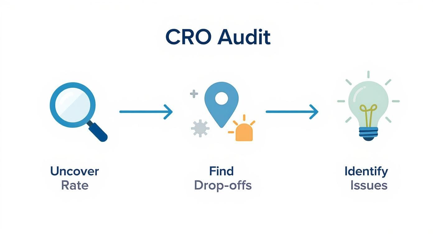
As you can see, once you "Identify Issues," the very next step is to create that list of fixes you'll need to prioritize.
Putting the Matrix into Action
Let’s make this real. Imagine your audit uncovers two big problems: a confusing mobile navigation menu and some seriously outdated product photos for a top-selling category.
Using the matrix, you’d likely classify the navigation fix as High Impact, High Effort because it’s going to need both design and development time. The photo update might be Medium Impact, Medium Effort.
But what if you also found that your return policy was buried and hard for customers to find? Adding a clear link to it in your website's footer would be a classic High Impact, Low Effort quick win. The framework makes the decision for you: tackle that return policy link right away, then start planning the bigger projects.
Optimizing Key Pages for a Better User Experience
Once you’ve knocked out the quick wins, it's time to dig into the pages that really move the needle: your product and category pages. Think of these as your digital storefronts. This is where a shopper's journey either ends with a satisfying "Add to Cart" click or a frustrating bounce. Even tiny points of friction here can have a massive, negative impact on your overall conversion rate.
The goal isn't just about making these pages look pretty. It's about making them work harder for you. We need to create an intuitive, confidence-building experience that answers a customer's questions before they even think to ask them, guiding them smoothly from browsing to buying.
Perfecting Your Product Pages
Your product page is your final, most important sales pitch. It’s where casual interest crystallizes into a real decision to buy. For that to happen, every single element needs to work in harmony to build trust, show off value, and crush any hesitation.
First things first: high-quality visuals are non-negotiable. Your customers can't touch or feel the product, so your images and videos have to do all the heavy lifting. This means going way beyond a single, clean shot against a white background.
- Show Every Angle: Leave no room for doubt. Provide a full 360-degree view of the product so customers know exactly what they're getting.
- Use Lifestyle Shots: Show your product in a real-world context. This helps customers visualize themselves using it. If you sell apparel, this means showing clothes on a model, not just a lifeless mannequin.
- Bring it to Life with Video: A short video demonstrating a product's features or showing it in action can be incredibly persuasive. I once worked with a clothing brand that saw a major conversion lift just by adding a simple clip of a model walking in a dress. It gave shoppers a true sense of the fabric's movement and fit.

Look at how the essential info—product title, images, price, and that all-important "Add to Cart" button—is immediately visible. This reduces the mental effort required from the user, making the decision to buy that much easier.
Writing Descriptions That Actually Sell
Beyond stunning visuals, your product descriptions need to be compelling and, most importantly, scannable. Nobody wants to read a wall of text. Ditch the long, dense paragraphs and use a mix of a short, benefit-driven paragraph with a bulleted list of key features.
Key Takeaway: Don't just list features; sell the benefits. Instead of saying "100% merino wool," try "Stay warm without the itch, thanks to ultra-soft 100% merino wool." See the difference?
Social proof is the final, crucial piece of the puzzle. You need to display star ratings and customer reviews prominently. One study found that simply displaying reviews can boost conversion rates by an incredible 270%. Feature a few of the most helpful reviews near the top of the page to build instant trust. For a deeper dive, our guide on landing page design best practices covers many of these trust-building principles in more detail.
Enhancing Category Page Navigation
If product pages are your final pitch, category pages are your expert guides. Their one job is to help shoppers find what they’re looking for without feeling overwhelmed. The secret to a high-converting category page is simple: effortless navigation and filtering.
When a shopper lands on a category with hundreds of products, a clunky interface is a deal-breaker. A robust filtering system is essential.
- Filter by What Matters: Let users narrow things down by size, color, price, brand, and customer rating.
- Make Filters "Sticky": Make sure filters stay applied as users browse. Nothing is more annoying than having to start over.
- Show the Product Count: Display how many products match a filter set. This helps manage expectations and guides the shopping experience.
By optimizing the user experience on these critical pages, you're removing the friction that kills sales. This focus on clear navigation, compelling visuals, and trust-building social proof is the foundation for turning more of your visitors into loyal, paying customers.
Mastering Technical and Mobile Performance
Let's be blunt: a slow, clunky, or broken website is the fastest way to lose a sale. In ecommerce, technical performance isn’t some back-end detail for the IT department—it’s a core part of your sales funnel.
Every time a customer has to wait for a page to load or pinch-and-zoom their way through your mobile site, you’re not just creating a little friction. You're actively pushing them toward your competitors. Getting the technical and mobile experience right is the foundation of any serious CRO effort. It’s about building a solid, reliable platform that lets your amazing products and marketing actually do their job.
Adopting a True Mobile-First Mindset
Designing for “mobile-first” means more than just having a responsive site that shrinks down to fit a phone screen. It demands a complete shift in thinking. You have to design for the reality of how people actually shop today—often with one hand, on the go, and with absolutely zero patience.
This means every single element, from your navigation menus to your product filters and checkout forms, has to be dead simple to use on a small touchscreen.
- Large Tap Targets: Are your buttons and links big enough to be tapped easily without hitting the wrong thing? Misfires are infuriating.
- Minimal Typing: Streamline your forms. Only ask for what is absolutely essential. Better yet, offer one-click payment solutions like Apple Pay or PayPal to eliminate typing altogether.
- Thumb-Friendly Navigation: Place your most important navigation links and calls-to-action where a user's thumb can naturally reach them. Don't make people stretch.
The data backs this up. By 2025, mobile commerce is projected to account for a massive 59% of all online retail sales. But here’s the interesting part: while most of the traffic is mobile, desktop still converts better, with an average rate of 4.8% compared to mobile's 2.9%. That gap is almost entirely due to lingering usability issues on smaller devices—a huge opportunity for stores that get it right.
Prioritizing Blazing-Fast Site Speed
Every. Second. Counts. A mere one-second delay in page load time can send bounce rates through the roof and tank your conversions. Today's shoppers expect an instant, seamless experience. If your site feels sluggish, they’ll assume it's untrustworthy or just plain broken.
Site speed isn't a single thing you can fix; it's the sum of many technical parts working in harmony. A few of the biggest wins usually come from focusing here:
- Image Compression: Huge, unoptimized images are the number one killer of site speed. Use modern formats like WebP and run everything through compression tools to shrink file sizes without sacrificing quality.
- Browser Caching: This is a simple fix that allows repeat visitors to load your site much faster by storing static files—like your logo and navigation—on their own device.
- Minimizing Code: Get rid of unused plugins, apps, and old code that might be weighing down your store's performance. Clean code is fast code.
The core of a fast website comes down to how quickly it can load its main content, respond to user interactions, and maintain visual stability. These elements are a key part of Google's ranking factors.
These performance metrics aren't just for a good user experience; they're also critical for SEO. If you want to get into the weeds, you should learn what Core Web Vitals are and see how they directly impact your site's visibility. A fast, stable, and responsive site is rewarded by both search engines and customers, making it one of the most powerful levers you can pull to boost conversions.
Streamlining Checkout to Reduce Cart Abandonment
You’ve done all the hard work. You audited your site, dialed in your product pages, and got your site speed humming. A customer loves what they see, fills up their cart, and heads to the checkout. This is it—the final hurdle.
But this is precisely where an astonishing number of sales evaporate. The checkout is where a shopper's excitement can instantly curdle into frustration. A clunky, confusing, or untrustworthy process is the number one reason people abandon their carts. Your mission here is simple: make this last step the easiest one of all.

Remove Unnecessary Barriers to Purchase
If there's one mistake I see stores make over and over again, it's forcing users to create an account before they can pay. This is a massive conversion killer. Many shoppers, especially first-time buyers, aren't ready for that kind of commitment. They just want their stuff.
The fix is incredibly simple: always offer a guest checkout option. Letting people check out with just an email and shipping info removes a huge psychological barrier and will absolutely get more people across the finish line.
Achieve Total Price Transparency
Nobody likes a nasty surprise, especially when it involves their wallet. One of the top reasons shoppers ditch their carts is getting slapped with unexpected costs right at the end. Hidden shipping fees, taxes, and random handling charges create sticker shock and instantly shatter trust.
Be completely upfront about every single cost. Here’s how to build that trust from the get-go:
- Shipping Calculator: Put a shipping estimator right on the cart page, before the formal checkout even begins.
- Clear Totals: Show the full, all-in price—including taxes and shipping—as early and clearly as you can.
- Free Shipping Banners: If you offer free shipping above a certain threshold, shout it from the rooftops with banners and notifications throughout the site.
This isn't just about reducing abandonment. It’s about showing customers you respect them, which is how you earn their loyalty.
A store I worked with was battling a staggering 75% cart abandonment rate. By implementing just two changes—adding a progress bar to show shoppers where they were in the process and introducing a prominent guest checkout option—they reduced that rate by 20% within a month.
Simplify Forms and Offer Multiple Payment Options
Your checkout forms should feel effortless. Every single field you force a customer to fill out is another opportunity for them to get annoyed and bail. Be ruthless. Only ask for the absolute bare essentials needed to get the order out the door. Better yet, use features like address auto-completion to make it even faster.
On top of that, you need to cater to modern payment habits. Not everyone wants to dig out their wallet and punch in 16 digits. Integrating trusted, one-click payment gateways can dramatically speed things up and send your conversion rate soaring.
- Express Payments: Offer options like Apple Pay, Google Pay, and PayPal. These let shoppers check out in seconds using information they already have stored and trust.
- Traditional Cards: Make sure the logos for Visa, Mastercard, and other cards you accept are clearly visible.
- Trust Signals: Place security badges (like SSL certificates) right near the payment fields to reassure nervous customers that their data is safe.
By focusing on these checkout optimizations, you make the final step the easiest part of the buying journey. For a deeper dive, check out our guide on how to reduce cart abandonment for more advanced strategies. A seamless path to purchase is one of the highest-impact ways to improve your ecommerce conversion rate.
Building a Culture of A/B Testing
Let’s get one thing straight: conversion rate optimization isn't a project you can just check off a list. It’s a mindset. To really move the needle, you have to shift from making changes based on guesswork to making decisions backed by real data. It's an ongoing cycle of learning, adapting, and improving.
This is where building a culture of A/B testing becomes your secret weapon.
A/B testing, or split testing, is a beautifully simple but powerful method. You just create two versions of a webpage (an ‘A’ and a ‘B’), show each version to a different segment of your audience, and see which one performs better for a specific goal.
The golden rule? Change only one element at a time. This is what makes it a real experiment, ensuring you can confidently say that one specific tweak was responsible for the change in performance.
From Hypothesis to Data-Driven Decisions
Every solid A/B test kicks off with a clear, testable hypothesis. This isn't a wild guess; it's an educated prediction about how a change will influence user behavior.
A good hypothesis follows a simple framework: "If I change [X], then [Y] will happen, because [Z]."
Let's say you have a hunch that your main "Add to Cart" button is getting lost on the page. Your hypothesis could look something like this:
"If we change the 'Add to Cart' button color from the current blue to a high-contrast orange, then the click-through rate will increase, because the button will be more visually distinct and draw more user attention."
With that hypothesis in hand, you're ready to run the test. Half your visitors see the old blue button, and the other half see the new orange one. Once you've collected enough data, you just compare the results. If the orange button gets significantly more clicks, you have a data-backed winner.
For more ideas on what to test, check out these advanced conversion rate optimization tips that can help spark your next great hypothesis.
Prioritizing Your A/B Tests
So, where do you start? The biggest mistake I see is teams getting bogged down testing tiny details on low-traffic pages. You'll be waiting forever for results.
Instead, focus on the high-impact areas that the most users interact with. These are your big levers for growth:
- Headlines: Test different value propositions. What benefit resonates most with your audience?
- Calls-to-Action (CTAs): Don't just test colors. Experiment with the text ("Buy Now" vs. "Add to Bag") and placement.
- Product Images: Do your customers prefer clean, product-only shots on a white background, or do lifestyle photos showing the product in use convert better?
- Page Layout: Try rearranging key elements. Should customer reviews be above the description or below it? Test it.
By consistently testing, documenting everything you learn (both the wins and the losses), and applying those insights, you create a powerful feedback loop. This culture of continuous improvement empowers your team to systematically scale your wins, turning small, incremental improvements into sustained growth and a healthier bottom line.
Quick Questions and Straight Answers
Still have a few things on your mind about improving your ecommerce conversion rate? Let's tackle some of the most common questions we hear from store owners.
What Is a Good Ecommerce Conversion Rate?
This is the million-dollar question, and the honest answer is: it depends. The global average might be around 2-3%, but we've seen clients in niches like beauty and wellness consistently hit numbers well over 6%.
The real key here is to stop chasing an arbitrary number. Instead of fixating on industry averages, benchmark against your own past performance. Your goal should be steady, incremental growth—turning your 2% into a 2.5%, then a 3%. That's how you win.
How Long Does It Take to See CRO Results?
The timeline really hinges on what you’re changing. Small, focused tweaks can show results surprisingly fast. An A/B test on a call-to-action button for a high-traffic product page, for instance, might give you clear data in just a couple of weeks.
Bigger projects are a different story. If you're overhauling your entire checkout flow or making significant site speed improvements, it could take a month or more to roll out the changes and gather enough data to measure the impact accurately. The magic is in consistency; small, persistent improvements almost always lead to the biggest long-term wins.
The biggest mistake we see in ecommerce CRO is making changes based on gut feelings instead of data. The second is testing too many things at once, which makes it impossible to know what actually worked. And finally, ignoring the mobile experience is a guaranteed way to leave money on the table.
For a deeper look at the strategies that move the needle, this Founder's Guide to Plugging Revenue Leaks is an excellent resource. It provides a solid framework for building a data-driven plan to identify and fix the issues that are holding your store back.
Ready to turn more of your visitors into customers with a proven, data-driven strategy? The experts at Raven SEO can help you audit your store, prioritize high-impact changes, and implement a CRO plan that drives real growth. Schedule your no-obligation consultation today!